
 Lesson Plan: Unit - 03
Subject: P15A2AAD - Android Application Development
Topic of Study: Using Buttons, Check Boxes and Radio Groups
Grade/Level: Master of Computer Applications
Objective: To understand Buttons, Check Boxes and Radio Groups and its properties
Time Allotment: 55 Minutes
- Using Button, Check box and Radio Buttons
- Another common user interface element is the button.
- You learn about different kinds of buttons provided by the Android SDK.
- These include the basic Button, ImageButton, ToggleButton, CheckBox, and RadioButton.
- Buttons:
- A basic Button is often used to perform some sort of action, such as submitting a form or confirming a selection.
- A basic Button control can contain a text or image label.
- Exa.
- CheckBox:
- A CheckBox is a button with two states—checked or unchecked.
- You often use CheckBox controls to turn a feature on or off or to pick multiple items from a list.
- Exa.

- ToggleButtons:
- A ToggleButton is similar to a CheckBox, but you use it to visually show the state.
- The default behavior of a toggle is like that of a power on/off button.
- RadioButtons and Radio Groups
- A RadioButton provides selection of an item.
- Grouping RadioButton controls together in a container called a RadioGroup enables the developer to enforce that only one RadioButton is selected at a time.
- Exa.

- Using Button
- The android.widget.Button class provides a basic button implementation in the Android SDK.
- Within the XML layout resources, buttons are specified using the Button element.
- The primary attribute for a basic button is the text field.
- This is the label that appears on the middle of the button’s face.
- You often use basic Button controls for buttons with text such as “Ok,”“Cancel,” or “Submit.”
- Exa. of XML code

- Exa. of JAVA Code

- What is Toast?
- A Toast (android.widget.Toast) is a simple dialog-like message that displays for a second or so and then disappears.
- Toast messages are useful for providing the user with nonessential confirmation messages; they are also quite handy for debugging.
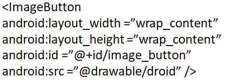
- Using Image Button
- A button with its primary label as an image is an ImageButton.
- An ImageButton is, for most purposes, almost exactly like a basic button.
- Click actions are handled in the same way.
- The primary difference is that you can set its src attribute to be an image.
- Exa. in an XML layout resource file:
- Using Check box
- The check box button is often used in lists of items where the user can select multiple items.
- The Android check box contains a text attribute that appears to the side of the check box.
- This is used in a similar way to the label of a basic button.
- In fact, it’s basically a TextView next to the button.
- Exa. XML layout resource definition for a CheckBox control:

- Exa. of Java Code.

- Using Toggle Button
- A Toggle Button is similar to a check box in behavior but is usually used to show or alter the on or off state of something.
- Like the CheckBox, it has a state (checked or not).
- Unlike the CheckBox, it does not show text next to it.
- Instead, it has two text fields.
- The first attribute is textOn, which is the text that displays on the button when its checked state is on.
- The second attribute is textOff, which is the text that displays on the button when its checked state is off.
- The default text for these is “ON” and “OFF,” respectively.
- Exa. of XML code

- Using Radio Group and Radio Buttons
- You often use radio buttons when a user should be allowed to only select one item from a small group of items.
- Exa. a question asking for gender can give three options:
- male, female, and unspecified.
- Only one of these options should be checked at a time.
- The RadioButton objects are similar to CheckBox objects.
- They have a text label next to them, set via the text attribute, and they have a state (checked or unchecked).
- If the user selects a RadioButton that is already checked, it does not become unchecked.
- Exa. of XML Code.

- Exa. of JAVA Code.
