
The Text components allows the user to add, view and edit data in a form of a web application.
JSF text component includes:
JSF text component includes:
- Label: A read only text that tells the user what the field name is
- Text Field: An editable field to enter the data.
- Text Area: User can enter the data that accepts more characters than the text field and can be scrolled easily to enter and view the data.
- Input secret text Field: The password and other sensitive information can be hidden from the users by displaying asterix or dot in the text field.
- The h:outputLabel tag is used to add labels in a JSF page.
- Namespace:

- Attributes :
- accesskey: Focus is transferred to this elements when pressed.
- class: The component class name for including CSS styles.
- for: associates with another component attribute with the name specified in "for".
- id: uniquely identifies a component.
- escape: indicates the characters sensitive to HTML and XML must be omitted by setting to true.
- onblur: Javascript code to execute when the focus on an element is lost
- styleClass: CSS class name to be applied while rendering the component
- tabindex: Order in which the element is focused by using the Tab key.
- value: Sets the value for the current component.
- onfocus: Javascript code to execute when the element is focussed.
- onclick: javascript code to be executed on click when the mouse pointer is clicked over this element.
- ondblclick: Javascript code to be executed on double clicking this element.
- Example:

- Output:

- The h:inputText tag is used to add text fields to the JSF page where user can enter data for the fields.
- Namespace:

- Attributes:
- id: unique identifier for the component
- alt: Sets the textual description for a component
- autocomplete: If the value is set to off the browser disables autocomplete feature for this component.If the value is set to on the autocompletion is performed without browser interfering.
- disabled: flag when set to true indicates that the focus should not be received or include during submission of a form
- immediate: Component events should be sent immediately rather than before the validation phase.
- label: localized name for the component
- maxlength: Maximum number of characters allowed for the field.
- readonly: restricts user from editing the value of the field.
- size: sets the width for the characters
- required: set to true indicates that the value is mandatory for this field on submitting the form.
- requiredMessage: the message that should be displayed on submit of the form.
- value: sets the current value for the component.
- Example:

- Output:

- The text area allows user to add multiple lines of text and submit the form.
- The h:inputTextarea tag is used to add a text area in the JSF page.
- Namespace:

- Attributes :
- cols: indicates the number of columns to be displayed.
- onchange: Javascript code to be executed when the value changes after gaining focus.
- onclick: Javascript code to be executed on click of an element
- onmousemove: Javascript code to be executed when the mouse pointer is moved within the element.
- onmouseout: Javascript code to be executed when the mouse pointer is moved away from the element.
- onselect: Javascript code to be executed when the user selects the text for this element.
- readonly: user cannot change the value of the text field.
- rows: Set the number of rows to be displayed.
- value: sets the current value for the component.
- rendered: indicates whether the component should be rendered or not.
- lang: indicates the language to be used for markup.
- Example:

- Output:

- The h:inputSecret tag is used for password fields where the entered data is displayed in the form of asterix or dot’s for enforcing security on the sensitive information.
- Namespace:

- Attributes:
- id: unique identifier for the component
- validator: calls the validator method that validates a particular JSF component.
- validatormessage: the message that will be displayed to the user upon the validation of a JSF component instead of the built-in standard message.
- value: sets the current value for the component
- rendered: indicates whether the component should be rendered or not.
- maxlength: number of characters allowed for the component.
- redisplay: indicates whether the previously entered password should be displayed or not.
- onclick: Javascript to be executed on click of the button for the component.
- readonly: indicates that the value cannot be edited by the user.
- onblur: Javascript to be executed when the element loses the focus.
- size: indicates the width of the characters to be entered.
- style: indicates css styles that can be applied for a component.
- Example:
- LoginForm.xhtml

- success.xhtml

- failure.xhtml

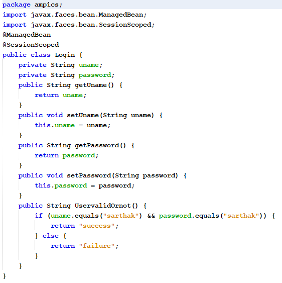
- Login.java
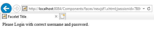
- Output - 1

- Output - 2

- Output - 3
Tags:
Java